How to read a crypto price chart: basic concepts for beginners
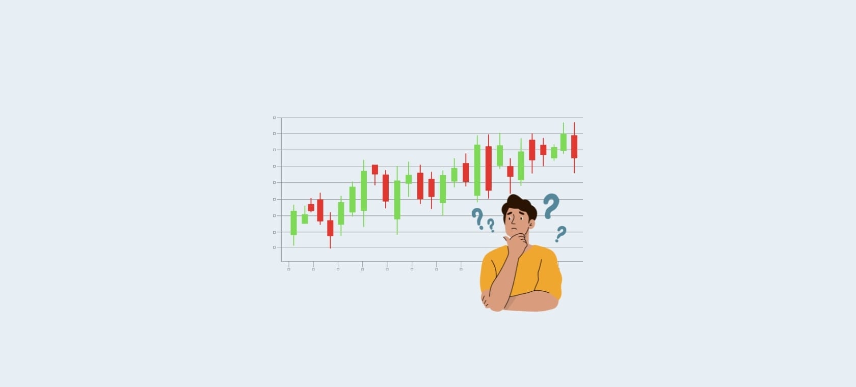
Line and candlestick charts, volume, support and resistance, trend lines, and the moving average. In this guide, we explain the basic concepts that help you understand a cryptocurrency price chart.
Table of contents:
The price chart is one of the first tools you'll come across when you start exploring cryptocurrencies on a platform like Bitcoin Store, but for someone new to cryptocurrencies, that tangled set of lines, candles, and numbers can seem like indecipherable code.
The good news is that reading a price chart comes down to a handful of basic concepts that, once you've grasped them, you can apply to any cryptocurrency, stock, or financial market.
Price and timeframe
Every chart has two axes. The vertical (Y) axis shows the price, usually in euros, dollars, or another fiat currency, while the horizontal (X) axis shows time. Together, these two axes show how the price moved over the selected period.
Before reading a chart, it's important to choose the timeframe that fits your goal:
- Short timeframe (1 minute – 1 hour) is used by traders who follow the market hour by hour or minute by minute.
- Medium timeframe (4 hours – 1 day) gives a clearer picture of the short-term trend without the noise of every individual transaction.
- Long timeframe (1 week – 1 month) is useful for investors looking at the bigger picture and longer-term cycles, such as those tied to Bitcoin halving.
The same data can look completely different depending on the timeframe you choose. A chart that looks stable on a daily level can show wild swings on a five-minute level.
Line chart
The simplest way to display price is a line chart. Instead of detailed data for each period, the line simply connects a series of recorded prices over time into one continuous path. Below the line, there's often a light colored fill that highlights the price movement, but it's purely a visual effect and doesn't carry any additional information.
You can see this type of chart on the Bitcoin Store platform as well, with time filters like 24h, 1w, 1m, 1y, and "All", which let you choose the range of data displayed.
The advantage of a line chart is clarity: at a glance, you can see whether the price generally rose or fell over the selected period, without needing to interpret any additional markers.


Candlestick charts
The most widespread way of displaying price in the crypto world is the candlestick chart. Each "candle" represents one time period (e.g. one hour or one day) and contains four key pieces of information:
- Open: the price at the start of the period
- Close: the price at the end of the period
- High: the highest value reached during that period
- Low: the lowest value reached during that period
The body of the candle shows the difference between the opening and closing price, while the thin lines above and below the body (known as wicks or shadows) show the highest and lowest price reached. A green or white candle usually means the price rose during that period (close higher than open), while a red or black candle means the price fell.
Stringing candles together one after another creates a pattern that traders use to gauge market sentiment, whether buying or selling activity prevailed during the observed period.

Trading volume
Below the price chart, there's often a second, smaller bar chart, this is volume. It shows the total turnover of the cryptocurrency during that period.
Volume is useful because it shows the strength behind a price move. A price increase accompanied by high volume is generally considered a more reliable signal than a price increase on low volume, where the move is easier to interpret as random or short-lived.
Support and resistance
Two terms you'll often hear in chart analysis are support and resistance:
- Support is a price level where, historically, downward moves often stop and the price bounces back up. Think of it as a "floor" the price struggles to break below.
- Resistance is a level where upward moves often stop. A "ceiling" the price struggles to break above.
These levels aren't hard rules, but zones where there was heightened buying or selling activity in the past, which is why market participants still watch them today.
Trend lines
A trend line connects a series of consecutive peaks or troughs on the chart and helps visualize the overall direction of price movement:
- Uptrend (bull trend): a series of progressively higher lows, price generally rising.
- Downtrend (bear trend): a series of progressively lower highs, price generally falling.
- Sideways trend (consolidation): the price moves within a relatively narrow range with no clear direction.
Recognizing the trend helps put individual price moves into a broader context.
Moving average
The moving average is one of the most widely used indicators for beginners. It's a line that smooths out price fluctuations by showing the average price over a set number of periods (e.g. 50 days or 200 days).
When the price is above the moving average, this is often interpreted as a sign of an uptrend; when it's below, as a sign of a downtrend. Traders sometimes use the crossing of two moving averages of different lengths (e.g. a short-term and a long-term one) as a signal of a possible trend change.
Market cap isn't the same as price
A common misconception among beginners is equating the price of a given cryptocurrency with its overall value. The unit price also depends on the total number of coins in circulation, so a low unit price doesn't necessarily mean a project is "cheap," nor does a high unit price mean it's "expensive."
Market cap, the product of price and the number of coins in circulation, is a more realistic indicator of a project's size and relative value, and it's usually displayed separately from the price chart itself.
Bringing it all together
When you open a chart, it's helpful to go through a few steps:
- Choose the timeframe that fits your horizon (short-term trading or long-term monitoring).
- Look at the overall direction, whether the trend is up, down, or sideways.
- Check the volume to gauge the strength of the move.
- Note the support and resistance levels that could affect future movement.
- If needed, add a moving average for a clearer picture of the trend.
Reading a price chart doesn't guarantee predicting future movements, crypto markets remain volatile and subject to rapid changes. But understanding these basic concepts lets you look at charts more knowledgeably, instead of them seeming like a random series of lines and colors.


